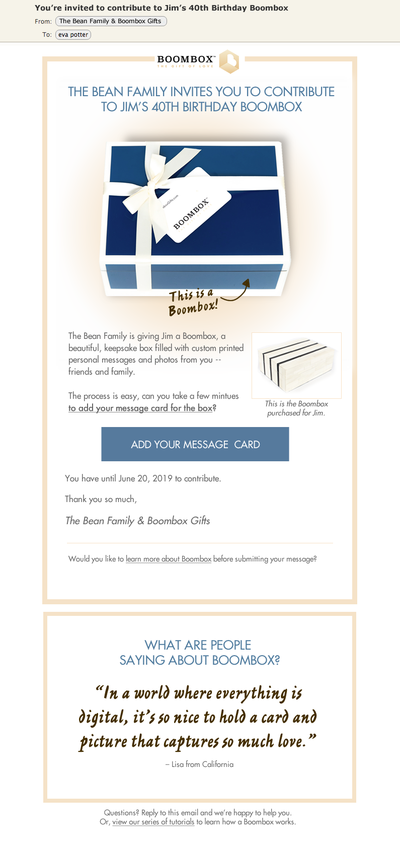
My goal was to make the email as concise and to-the-point as possible. I suggest that instead of bunch of text and images trying to explain what is a boombox that we do an "explainer" animated GIF that loops (that would be located where you see the blue box image). I suggest more detailed instructions on how to contribute to be on a tutorial page, not in the email.
Large and center is the explainer GIF, short description of why they are getting the email and then a large "call to action" button to get the user to go to the contributor page.
I suggest the section for the quotes to start with Oprah, as it shows legitimacy and recognition of the gift/company, building trust for the user, and then rotate to the other testimonial quotes. Alternatively, just only show logos of all media/publications to build trust.
Along with Futura, I suggest a secondary handwritten style font to convey the personal touch of the gift and company's philosophy. I also suggest an accent color of blue that goes well with the brand's light gold/yellow and the "hero" boombox.